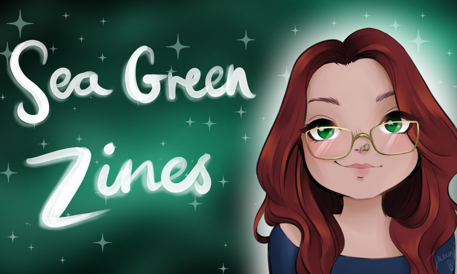
Zine Review: It’s Odd.

It’s Odd.
Latibule
4 pages (one-page mini)
https://www.instagram.com/latibule_art/
https://www.facebook.com/groups/2823389601293323/

It’s Odd is a full-colour, one-page mini-zine about the mixed feelings that come with a diagnosis that confirms things you long suspected.

It’s Odd opens right into things with, “It’s odd, knowing you were right” accompanied by a drawing of Latibule (with snail characteristics as seen on the cover). From there, we read about Latibule always knowing she was different and experienced the world in a different way.

The text is accompanied by Latibule’s art, which I love. There’s so much emotion conveyed in the drawings that was so easy for me to pick up her feelings and empathise.

This is a lovely little mini that beautifully explores that strange and almost indescribable feeling of being proven right about news that one has to come to terms with. It seems like such a complicated thing – something I have pondered many times in my own life – and yet Latibule expresses that ‘odd’ feeling so well.

Definitely pick up a copy.

Zine Review: basic paper airplane: The Cassette Tape Issue

basic paper airplane: The Cassette Tape Issue
Joshua James Amberson
56 pages
https://antiquatedfuture.com
https://zinewiki.com/wiki/Basic_Paper_Airplane

basic paper airplane: The Cassette Tape Issue is a US-sized, half-fold black and white zine for the love of (and sometimes frustration with and doubts about) the humble cassette tape.

Sometimes you need to go with the beautiful description on the zine itself:

“Twenty writers, musicians, DJs, label owners, publishers, and comic artists tell stories of how cassette tapes have affected their lives, for better or for worse. Within: the art of the mixtape, the importance of the boombox, the intimacy of the Walkman. Plus tales of recording with cassettes, performing with cassettes, releasing cassettes, falling in love with cassettes. Nostalgia, subversion, frustration, possibility.”

Now this is the sort of nostalgia I am all about. I remember holding my little boom box up to the TV in an effort to record the music that played during THAT infamous Final Fantasy VII scene while my heart was breaking. But this isn’t about my memories. Let’s dig in.

basic paper airplane: The Cassette Tape Issue opens with a Track List (table of contents) split into the A side and B side, which I love as a little detail. From there we get a personal introductions to Josh’s life with cassettes and the nagging worry of whether one’s passion equates to a life well spent. Josh goes on to write a little something that I’m encountering within my writerly self more and more:

“But, as a writer, I’m never content with unexplored joy. I want to pick it apart and understand it, open up its contradictions and absurdities.”

Ah, I know that feeling all too well.

We then read a brief timeline of the life of cassettes as well as a brief primer about how cassettes work and have worked through time. From there we get to the shared experiences of first cassette tapes, the freedom of easily transported music on the Sony Walkman, the trials and tribulations of trying to respool that precious musical tape back onto the wheels. Everything is in black type on white paper with a clear tape-insert background for the title. (I love it when zines add in little details to fit a theme.) Some are accompanied by anything from cassette diagrams to actual mixtape lists.

This is the kind of zine that makes me want to share my cassette tape stories. I read the stories written by these contributors and want to tell them how I remember this or had a similar experience with that. Oh, and do you remember…

I could go on and on. I had so much fun reading this zine and think anyone who grew up with cassette tapes, grew to love them, still love them, and even perhaps even still love being able to hold that Walkman close and play those cassettes just for your eager ears will love this zine.

Mini Zine Review: 6 Things I Don’t Like About Depression

6 Things I Don’t Like About Depression
Elisa
4 pages (one-page mini)
https://www.instagram.com/elisaszines/

6 Things I Don’t Like About Depression is a black and white, one page mini zine about six effects of depression Elisa doesn’t like.

Sometimes I will read a zine because I’m really ‘feeling’ it, and today this mini really spoke to me.

6 Things I Don’t Like About Depression opens right up into the six things, with each depressive symptom getting its own page for the symptom title and a few thoughts from Elisa about the symptom. Each page has nicely sized big type so it’s easy to read even in low light.

I must admit I thought a mental ‘Yes!’ when I saw the first thing mentioned: Fatigue. People experience depression in different ways and at different times, of course, but fatigue has been at the top of my list lately, so this felt like a meant to be read. While I didn’t feel each symptom in quite the ways Elisa did, I have and do experience all of those symptoms. That just goes to show that even if we both call a symptom something, that doesn’t mean we all experience and interpret it in exactly the same way.

One thing I wanted to note is how, with the way Elisa writes, it was easy for me to make connections between symptoms. Fatigue can make you feel sad because you don’t have the energy to do things. Sadness can make personal hygiene difficult. So on and so forth, around and around.

I’d love to see a sequel to this along the lines of ‘6 Ways I Deal With Depression’ because I’m me and those are the sort of things that make my heart happy. That said, this is a lovely little zine reminder that you aren’t alone and could make for a good introduction to depression for someone who isn’t familiar with it.

Zine Review: Thicker than Water

Thicker than Water
Frank Candiloro
44 pages
https://australiancomics.fandom.com/wiki/Frank_Candiloro
https://frankencomics.bigcartel.com

Thicker than Water is an A5 size, black and white mature readers horror comic zine about whether we can truly break free from so-called family.

This one definitely is for mature readers – not in language but in content.

Thicker than Water opens with a nice and clear information page (though I did note most of the links aren’t working, and I found the above links by searching). From there, we begin with once upon a time through the dark woods and the ungodly sight of the Kraven residence…

The Kravens are made up by Mother Kraven and her dear sons Hansen and Gunnar. Their typical diet isn’t exactly polite or friendly, and obtaining the food they eat sets Gunnar on a path that ultimately has him questioning his life, identity, and whether blood is thicker than water.

Frank’s art style really draws me in – no pun intended. On one level, it reminds me somewhat of the show Samurai Jack, but there is more of a horror element to it. Frank truly makes it their own, distinguished style. The panels are nice and big so you can see what’s happening, and there is plenty to pay attention to. The content can be gruesome at times, but I couldn’t help but take a closer look at each panel.

I tried not to tell too much of the story because, even though it is told in a horror genre way, it leaves the reader a lot to ponder. Sure, you could pick this up, enjoy it, and put it down. But you could also pick it up, read it, and be urged to think about the meaning of family, blood, breaking free, and what’s necessary to truly to that – if being truly free is actually possible.

Perhaps it’s because I personally cut off ties with my ‘blood’ a long time ago that this really hit me, but I think others may feel the same way.

All up, Thicker than Water is a great adult horror comic with some interesting themes if you care to think deeply about them. Everything about this comic wants me to read more of Frank’s creations, more comics in general, and more horror. A win for certain.

Zine Review: Why Does Society Care So Much About My Body Hair?

Why Does Society Care So Much About My Body Hair?
Crash Reynolds & Edd Castillo
8 pages
https://utopiabycrash.wixsite.com/hello
https://www.instagram.com/indeliblecrash
https://www.instagram.com/ozzyugi/

Why Does Society Care So Much About My Body Hair? is an 11cm x 14cm black text on coloured paper zine about feelings around body hair and body hair expectations.

Razors, waxing, societal expectations… Never the makings of a good thing.

This mini opens with Crash writing about body hair embarrassment when they were younger. Crash was prevented from shaving and required to wax if they wanted to remove body hair. Crash writes briefly about the shame around body hair and how that goes against the traits that we’re trained to believe society expects. After this, in the middle of the zine on neon orange paper, Edd shares their body hair experiences from youth in comic form. From there we go back to Crash who struggles with their feelings around their leg hair but is starting to face it.

As a person with PCOS, I am well-acquainted with the trials and horrors around body hair, so I already empathised with Crash and Edd on the subject. Crash’s writing is thoughtful and to the point whereas Edd features a setting I’ve never been in: the boys locker room for the opposite kind of experience I have faced.

I loved that Crash and Edd teamed up to share both of these experiences though because it makes it oh so clear that so many people experience this kind of pressure. Two sides of a coin, if you will. I think it was a great way to handle a big picture with only two authors.

Why Does Society Care So Much About My Body Hair? left me feeling a bit sad about why humanity continues to demand things of each other that don’t really matter in the end. (Your body, your choice.) But I am glad to see zines like this because body hair is still very much a discussion in media for various reasons. This is definitely worth picking up, reading, and pondering. And, perhaps, making your own zine on the topic.

Zine Review: A Zine-Zine Proposition

A Zine-Zine Proposition
Billy McCall
8 pages
https://www.patreon.com/iknowbilly
https://www.youtube.com/user/iknowbilly

A Zine-Zine Proposition is a US-sized, half-fold, black and white, primarily text zine collection of the best/worst lines from Winner Takes All to create an out-of-context text…

This zine probably wasn’t intended for serious examination by any means, but I needed a laugh today, and this zine certainly provided. Also, not really suitable for younger readers.

Out of habit, I looked at the cover and then looked at the back – something I recommend doing with this zine. Billy gives his own take on the synopsis of Sebastian and Missy’s ‘love’ story, which had me chuckling straight away and feeling prepared for what I would find inside. Well, as prepared as I could be.

Inside Billy launches right into his featured bits and pieces of Winner Takes All. Through these chosen bits of text, we are introduced to Sebastian and Missy – neither of which quite get to any sort of positive light. They’re in Vegas, and they’re tempted to some adult activities with each other. All of which you picked up from Billy’s synopsis.

While these look like complete sentences and paragraphs taken out, some are actually just phrases and snippets. They are more than enough, however, as the reader moves back and forth between wondering what in the world is going on and what in the world kind of sentence is “He wasn’t undisturbed by her nearness”.

On the back, Billy asks if any of this makes sense taken out of context like this. Sort of… but then again, it doesn’t really matter. If you’ve read these sorts of books, you can fill in the blank spots. If you haven’t, I hope the confusion you feel is an amused sort of confusion.

A Zine-Zine Proposition is exactly the sort of zine I wanted to read today: something a bit ridiculous that made me laugh out loud. On one hand, I feel bad for the writer. But I have also enjoyed many a cheesy romance novel in my time as well, so I know just how high the cheese gets piled at times and can laugh along with my guilty pleasure. If you’re like a chuckle, pick this one up.

Really though, what about Tim and all his anime?!

Zine Review: Moon

Moon
Edited by Joseph Carlough
16 Authors
20 pages
https://www.displacedsnail.com
https://www.instagram.com/displacedsnail/

Moon is a 9cm x 14cm black and white, primarily text zine with short pieces from sixteen different authors on the theme of ‘moon’.

I am all about moon and stars aesthetics lately, so I got right into this one.

Moon opens to a title page before going into the first short story: a funny consideration from Carolyn Busa about why it’s probably best that we aren’t going to the moon. (Not what I expected in this zine, let alone for the first piece, but that just gave me an even bigger smile because of it.) There are more contemplative stories, myths, and even comics as well. The role of the moon during the Civil War in the piece by Heather Butts touched me as it mentions Harriet Tubman – someone who has been an inspiration to me since I wrote a report about her in third fourth grade.

The layout of this zine is lovely. The slightly marble blue paper of the title page is a nice touch an carries the colour in from the cover. The type is clear and easy to read, and each author/artist’s details are even easier to read.

I’m impressed by the writers given their rather dramatic limitations on word count, but I have to tip my hat to the comic artists for packing so much into such a small space.

Some of the pieces really hit it for me, and some didn’t. This is the nature of a collaborative zine and one of the reasons I love this type of zine. These are all new-to-me names, and it’s nice to have details for following up with people whose creations really struck me.

If you’d like to try something new with a mixture of new voices, then this is definitely a zine for you to check out.

Zine Review: Welcome To Nursing HELLo

Welcome To Nursing HELLo
Joel Craig
36 pages
http://www.welcometonursinghello.com
https://www.amazon.com/Joel-Craig/e/B00F2L9H9M/ref=dp_byline_cont_pop_book_1

Welcome To Nursing HELLo is a 13.5cm x 17cm black and white comic zine about Joel’s life as a nurse.

This is one of those zines I’m very curious about but am almost a little wary because nurses go through a lot of intense situations! But curiosity wins.

Welcome To Nursing HELLo opens with some fine print type details on the inside front cover before getting right into the comics with a brief introduction to Joel. From there we get into a wide variety of topics: the impact of hours and scheduling, interactions between nurses and between nurses and doctors, and even a dream with Madonna. Some stories are funny, some tense, and others are even educational with a ‘tips for nurses’ feel.

The middle spread of the comic serves as a game board for ‘The Nurse Game’, which even has a set of rules and some ‘Get Out of Employee Heath Free’ cards. With board spots like “Catch a PT having sex in their room w/visitor but they have visitor ID band. Close door” and “Perform well during a code. Move ahead 3 spaces”, it’s not a game for the faint of heart.

The zine wraps up with a few panel hints about what (I assume) will be coming in the next zine.

Zine Review: Welcome To Nursing HELLo is a perzine in comic form, and I love a perzine. I prefer to start at the beginning of a series, but starting with the second one didn’t leave me wanting or confused for having not read the first one. It continues on seamlessly (from all appearances) from the first one after the brief introduction.

Anything I was confused about came from a lack of nursing knowledge. For instance, I had no idea what a charge nurse is, but I did get the general gist of the role from the comic. I’m also still not clear about nurse hierarchy and have no idea what an NA is, but there was nothing that took me completely out of the story itself. (Nor do I feel they need explaining within the comic unless it’s specific to the story like “I had to report to this person”.)

Joel’s writing is real about how things are happening but doesn’t get stuck in details (as you really can’t for a well-paced comic with limited text space) – and also doesn’t get into any shock/horror factors, which I greatly appreciated.

All up, Zine Review: Welcome To Nursing HELLo was a very interesting read with a lot of unfamiliar to me content. There wasn’t much I could identify with as such, but that made it all the more satisfying to my curious self. I recommend giving this one a look, and I will be getting the others in the series.

Zine Review: Better Than Me: a zine about comparison

Better Than Me: a zine about comparison
Elisa
8 pages (1 A4 page folded)
https://www.instagram.com/elisaszines/
https://www.etsy.com/shop/elisaszines

Better Than Me: a zine about comparison is a 1-page-folded, black text on green paper mini-zine about comparison and

“Comparison is the thief of joy.” – Theodore Roosevelt

This is one of my favourite quotes as belittling myself by comparing myself to others is something that I’ve worked hard on stopping. As you can imagine, the moment I saw this zine, I knew I had to read it.

Elisa opens right into the text, writing about how they’ve always had a problem with self-esteem. Elisa then writes about struggling with confidence and thinking poorly of themself to the point of insults and self-punishment. But Elisa shares hope in having spent years in recovery and learning self-love and appreciation. They even write a sort of call to action for the person reading to try to change perspective and society.

All wrapped up in a little mini.

This is one of those zines that simply spoke to me, and I struggle to see it from an impartial reviewer’s eyes. I know what it’s like to constantly drag myself down, and with the utterly easy access to social media, it’s easier than ever to use others as a mean to berate ourselves. As much as I would love to see this zine expanded into a chunky monkey of a zine on the topic, there is so much value to a short and sweet message of ‘you are enough’.

If you struggle with comparing yourself to others, this mini is a lovely pocket reminder that you’re not alone and that it’s possible to dismantle the habit of comparison.

Zine Review: Six of Swords

Six of Swords
Wesley Sueker
22 pages
https://twitter.com/twentytwozines
https://www.youtube.com/channel/UC0cuGEP5neJCsjfkbBy6I2w
https://www.etsy.com/au/shop/TwentyTwoZines

Six of Swords is an 11cm x 19cm black and white zine mixture of perzine and info zine exploring the Six of Swords in the tarot and its related symbolism.

Six of Swords opens with a quote from The Haunting of Hill House before we are introduced in perzine fashion to the melancholic nature of sixes in the tarot. Usually I would wait to write about Wesley’s writing style, but this was a magnificent blend of personal story launching into the main topic.

This blend of information with perzine qualities continues as Wesley writes about the nature of the card influencing the creation process with the zine itself, sixes not only in the tarot but in numerology, a breakdown of the symbolism of the cover art, and more.

The aesthetic of this zine is so lovely on so many levels. From the ‘easter egg’ of the zine having twenty-two pages (Wesley of Twenty Two Zines), to the zine itself being shaped like a tarot card. Inside, the zine features Six of Swords cards from various decks, and it’s interesting to see the different visual interpretations.

I learned even more than I was expecting in Six of Swords, which was a lovely surprise considering that I was expecting to learn a lot. Wesley has been incredibly thorough. I was also excited to see Knight of Cups, Judgement, and Death zines continuing on this series in Wesley’s Etsy shop. If I may be so bold – Queen of Pentacles next perhaps? Haha.

Six of Swords is everything I was hoping it would be and more. This whole series is going onto my wish list for sure. If you have any interest in tarot (especially with a perzine flair), check out this zine.